Ink on paper
A live tuner for the site's own paper + blend + bleed recipe. Swap textures, tilt the ink, watch fibers soak through Caveat strokes.
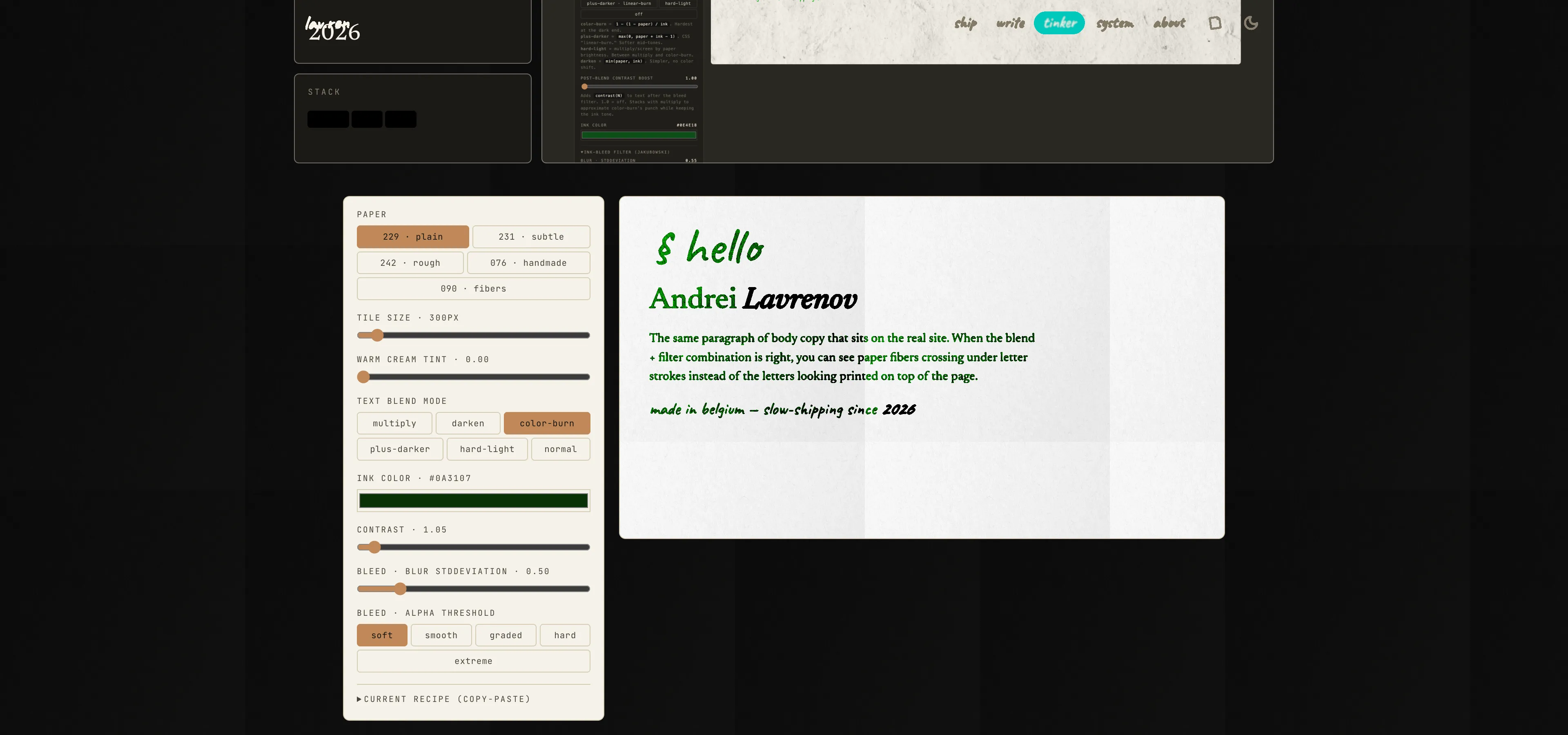
The current version of lav.ren paints text on paper, not next to it. The page
background is a tiled photograph of a real sheet (mostly white, with fibers
and dark specks), and every text element renders with
mix-blend-mode: color-burn plus an SVG ink-bleed filter. Where a paper
fiber passes under a letter stroke, the letter darkens in that spot — ink
soaked into fibers instead of printed on top of them.
Figuring out the exact recipe took a pile of knobs: which paper file, which tile size, which blend mode, which ink color, and two more dials on the ink-bleed SVG filter itself. The playground below is the same tuning surface the site was dialed in with — you can swap any parameter and see the effect immediately.
Why photographed paper beats fractal noise
The old background was a single 128×128 SVG of feTurbulence noise at 8%
opacity. It’s technically texture, but at that strength and frequency it
reads as “faint dither on cream” — invisible from a metre away, and
completely inert under blend modes because the luminance range is tiny.
A real paper photograph has big dark specks, long fibers, and a cream
bias that sums to something color-burn can actually interact with.
Why color-burn, specifically
multiply would also blend ink into paper — but dark ink multiplied
against mostly-white paper collapses to dark ink. Color-burn, by contrast,
amplifies the darker paper regions much more aggressively, so the fibers
show through letter strokes visibly. The trade-off is color shift:
color-burn of a warm near-black ink against cream paper comes out slightly
olive. The fix is to pick an ink color that color-burns to the tone you
actually want. The site’s live color is #0a3107 (forest green), which
lands on near-black with a warm edge.
Why the filter lives on each element
mix-blend-mode composites against whatever is behind the element in the
same stacking context. If you wrap text in a container that forms its own
stacking context (say, via z-index: 2; position: relative or
isolation: isolate over an opaque parent), the text blends against that
container’s — usually transparent — backdrop, and the effect collapses to
“looks normal, I think?” The rule has to apply directly to the text node,
and the ancestor chain up to the body has to avoid creating an opaque
stacking-context barrier.
Credits
The ink-bleed filter is the
Jakubowski recipe —
CSS blur() into feComponentTransfer feFuncA type="discrete", which
feathers the letter edges and then thresholds them back to binary alpha
so the outlines land irregular. A second reference that proved useful
while thinking about this:
stealing.rocks’ blurry-type recipe,
which gets a similar effect via contrast() on a wrapper.
Play with the sliders:
§ hello
Andrei Lavrenov
The same paragraph of body copy that sits on the real site. When the blend + filter combination is right, you can see paper fibers crossing under letter strokes instead of the letters looking printed on top of the page.
made in belgium — slow-shipping since 2026