Three iterations of a portrait parallax
From CSS translate to WebGL depth-map displacement — building a 2.5D portrait effect for the homepage, one iteration at a time. Interactive demos with sliders at each step.
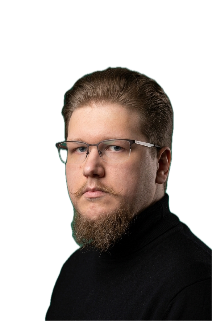
The homepage has a portrait tile — a transparent PNG of me sitting on a teal gradient. Static. I wanted it to feel a little more alive: a subtle response to the cursor, like a photo card you’re turning in your hand. Nothing dramatic. Just enough to make you go “huh, that moved.”
It took three passes to get the right feel. Each version taught me something about what “subtle” actually means when you’re animating a human face.
Version 1: CSS translate
The simplest possible parallax. Track the mouse, shift the image by a few pixels in the same direction. That’s it.
const tx = mx * offset; // mx is -1..1, offset is ~6px
const ty = my * offset;
transform = `translate3d(${tx}px, ${ty}px, 0) scale(1.05)`;
The scale(1.05) is a trick: the image is 5% oversized inside an overflow: hidden container, so when it translates there are no visible gaps at the edges. Without it, you’d see the background peeking through on one side as the image slides.
It works. Move the cursor over the demo below and drag it to the edges — you can feel the image respond. But it feels flat. The whole image moves as one rigid sheet. Your brain knows a face has depth, and this doesn’t respect that.
Version 2: CSS perspective tilt
What if the image tilted toward the cursor instead of just sliding? CSS perspective() combined with rotateX / rotateY creates a convincing 3D card-tilt effect with zero WebGL.
transform = `perspective(750px) rotateX(${rx}deg) rotateY(${ry}deg)
             translate3d(${tx}px, ${ty}px, 0) scale(1.04)`;
The perspective() value controls how dramatic the 3D effect is — lower values (300px) make it feel like you’re looking through a peephole; higher values (1500px) flatten it out. At 750px, it reads as a card being gently angled.
The translation is reduced to just ±1px here. The rotation does the heavy lifting now — ±7.5° is enough to feel physical without being distracting. Try cranking the rotation slider up to 15° to see what “too much” looks like.
This is a big improvement over V1. It feels like a printed card you’re tilting in your hand. But the face still moves as a flat surface — the nose doesn’t come toward you, the ears don’t recede. For that, you need actual depth information.
Version 3: WebGL depth-map displacement
The final version uses a grayscale depth map — a second image where brightness encodes distance from the camera. White pixels (nose, glasses, forehead) are close; dark pixels (background) are far.
A WebGL fragment shader samples this depth map for every pixel on screen and shifts the portrait texture by mouse_offset × depth × strength. Close pixels get the full shift; background pixels barely move. The result is a 2.5D displacement where the face appears to float forward:
float d = texture2D(u_depth, uv).r;      // 0=far, 1=near
vec2 offset = u_mouse * d * u_strength;   // scale by depth
gl_FragColor = texture2D(u_portrait, uv - offset);
Toggle “Show depth map” below to see what drives the displacement. Notice how the bright areas (nose bridge, forehead, shoulders) respond most to the cursor, while the dark background stays anchored.
The strength slider controls u_strength — the maximum UV displacement per unit of depth. At the default (0.025), the nose shifts about 17 pixels at full mouse offset. Crank it up to 0.08 and the effect becomes visibly distorted — the depth map’s imprecisions start showing.
What shipped
The homepage uses V3 with the depth map. The whole thing — WebGL engine, React island, shader — is about 300 lines of plain JavaScript with no dependencies. If WebGL is unavailable, it falls back to the V2 CSS tilt. If the user prefers reduced motion, it shows a static image.
The depth map was generated from the portrait using an AI depth estimation model, then cleaned up in Photoshop. At 65 KB for a 687×1037 grayscale PNG, it’s a small price for the effect it enables.
The shipped version tracks the mouse across the entire viewport (not just on hover) and eases with a JS lerp — current += (target - current) * 0.08 per animation frame. The demos above use local mouse tracking so you can compare them without them fighting each other.